Design
The Anatomy of a Perfect Lockup
By Adaeze Okafor • May 29, 2026 • 1 min read
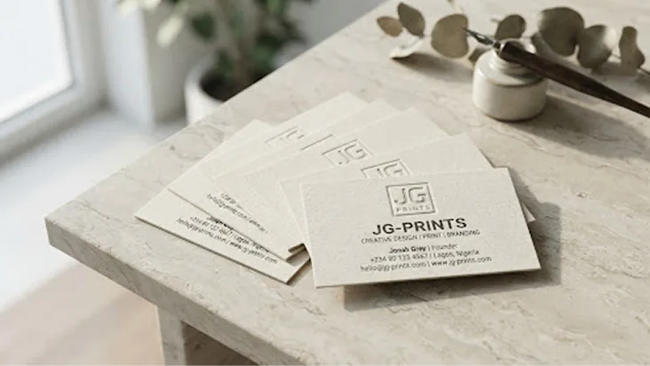
A lockup is more than a logo beside a name. It is a fixed relationship — proportions, spacing and alignment that survive every application from a pen barrel to a billboard.
The most common print failure we see is ignoring minimum size: detail that reads on screen disappears at 20mm wide. Test your lockup at the smallest size it will ever print.
Define clear space as a multiple of an element inside the mark itself, so the rule scales with the logo instead of fighting it.
Share: